



Author: SeitUP

What is CRM and Why Does a Small Business Need It: How to Stop Losing Clients to Inbox Chaos

Do you remember all of them? Who got a reply, who received a proposal, who is still waiting?

If yes — you’re either a genius or your business is still very small.

But as enquiries grow, everything without a system turns into chaos. Clients slip through the cracks. Leads go cold. Money is lost simply because you didn’t follow up in time. That’s where CRM comes in.

CRM Is Not Complicated. It’s Just Order

CRM stands for Customer Relationship Management. It’s simply a tool to help you manage people who showed interest in your business.

Think of it as a spreadsheet on steroids: interface, reminders, communication history, and a clear pipeline.

Everything is in one place — no sticky notes or missed messages.

Why Small Businesses Lose Clients

Someone reaches out, you reply, they say “I’ll think about it” — and you forget. A week later they go elsewhere.

These are lost leads. Up to 40% of enquiries in small businesses disappear this way.

The issue isn’t people — it’s trying to remember everything manually.

What CRM Can Do

  • Collect all enquiries in one place.
  • Show where each client is in the pipeline.
  • Remind you to follow up.
  • Store full communication history.
  • Provide analytics for decision-making.

The Most Expensive Mistake

Many think CRM is only for large companies.

In reality, small businesses need it more — because everything depends on one person.

Losing even a couple of clients monthly adds up quickly.

Best CRM Options

  • Notion or Trello — simple and free.
  • HubSpot CRM — powerful free plan.
  • Pipedrive — visual and easy to use.

Start simple and improve later.

How to Get Started

  1. List your enquiry sources.
  2. Define your pipeline stages.
  3. Add current clients immediately.

To Sum Up

CRM is about clarity and control, not technology.

You stop losing clients, see the full picture, and manage sales intentionally.

Chaos costs money. Order pays for itself.

FAQ

Do I need CRM with 5–10 clients?

Yes, it’s the best time to start.

Is CRM expensive?

No, there are free options. Paid plans start from €15–20.

How long does setup take?

A basic CRM can be set up in one evening.
Performance Marketing: What It Is and Why It Actually Works

What is Performance Marketing?

Performance marketing is a results-driven approach where every action—click, lead, or sale—is measurable.

Key difference: you pay for actions, not impressions.

Core Traits

  • Result-focused: sign-ups, sales, leads.
  • Full visibility: track every step.
  • Optimization: focus on ROI and CPA.
  • Testing: constant experimentation.
  • Scalability: grow what works.

Why It Works

Because it provides clarity:

“Spend €1000 → get 25 leads at €40 each.”

Key Metrics

  • CTR: click-through rate
  • CPA: cost per action
  • CPL: cost per lead
  • ROI: return on investment
  • LTV: lifetime value
  • CR: conversion rate

Where It’s Used

  • Search ads
  • Social media
  • Marketplaces
  • Email marketing
  • Native ads

Funnels

  1. Ad view
  2. Click
  3. Lead
  4. Email follow-up
  5. Purchase
  6. Retargeting return

Each step should be optimized.

Example

  • €0.60 per click
  • 5% conversion
  • €12 per lead
  • 20% buy for €100

Result: 1000 clicks → 50 leads → 10 sales → €1000 revenue.

Not Magic

  • clear positioning
  • strong offer
  • landing page
  • funnel structure
  • analytics

Conclusion

Performance marketing is about measurable results, not guesswork.

FAQ

Is it only ads?

No, any measurable channel.

Without a website?

Possible, but limited.

Difference from regular ads?

Regular ads focus on reach, performance focuses on results.

Brand Voice: How to Sound Like a Human and Get People to Trust You

What Exactly Is Brand Tone of Voice?

Brand voice is how your brand sounds in writing and media. It is the communication style that shapes the impression you leave: are you serious, witty, caring, dry, or annoying?

Important: voice is the personality, but tone is the mood. It is your rhythm, word choice, and emotional color.

For example:

“Submit your application and we will contact you.”
“Drop us a line and we’ll get back to you, no spam.”
“Send your inquiry. We’ll reply quickly and get straight to the point.”

Same message, three different tones. Each one creates a different feeling.

Why Does Your Brand Voice Matter?

Because people do not just read words. They feel them. And they make fast decisions:

  • Can I trust this brand?
  • Do these people feel like my kind of people?
  • Can I relax here or should I leave?

Your brand language is part of your brand personality. The more precise it is, the stronger the connection with your audience.

How to Build Your Own Tone of Voice

Step 1. Understand who you are as a brand

Ask a simple but powerful question: if your brand were a person, who would it be?

  • A calm and smart 35-year-old woman who explains things simply?
  • A bold 24-year-old guy with humor and edge?
  • A 40-year-old expert who gets to the point without extra talk?

This is not a game. It is the foundation. Your communication style should come from this persona.

Step 2. Define your audience

How can you talk to people if you do not know who they are?

  • Startups? — concise, energetic, direct.
  • Young mothers? — gentle, supportive, without pressure.
  • B2B? — professional, but without corporate stiffness.

Tone of voice is the point where brand personality and audience context meet.

Step 3. Choose your tone settings

Here is a simple model on a scale from 1 to 5:

Formality: 1 (casual) — 5 (formal)
Emotion: 1 (dry) — 5 (emotional)
Humor: 1 (serious) — 5 (ironic)
Simplicity: 1 (complex) — 5 (simple)

Decide where you are on each scale and stay consistent in every message, from the landing page to your email campaigns.

Step 4. Write down the rules

This can be one short document:

  • How we greet people.
  • How we explain difficult things.
  • Which words we use and avoid.
  • Where an emoji is acceptable and where it is not.
  • How we respond to negative feedback.

Without a guide, your team starts speaking in different voices, and that reduces trust.

Examples of Brand Tone of Voice

Edgy and witty

“We know why you’re here. Just buy it already and stop pretending you’re still thinking about it.”

Friendly and caring

“We packed everything, checked it twice, and it’s already on the way to you. With care.”

Dry and expert

“Submit your inquiry and our specialist will contact you to clarify the terms.”

Message tone affects sales

When you keep one tone across every touchpoint — landing page, stories, email, support — the customer feels stability and trust. They understand that this is not a one-time promotion, but a brand with character.

This directly affects:

  • memorability
  • conversions
  • repeat business
  • reputation

Conclusion: brands always sound like something

If you do not think about your tone, people will still read one into your messaging. The difference is that chance will choose it for you.

Tone of voice is not just about writing style. It is about attitude. It is about how you treat your customer as a person. In a world full of noise, the brands that sound human win.

FAQ

How do I know if my brand voice is weak?

If customers cannot tell whether you are formal or informal, if your ads sound different from your support messages, or if everything feels lifeless, your tone is not properly defined.

Do I have to use humor?

No. The main thing is to be authentic. Humor is a tool, not a requirement.

How do I apply tone of voice across a team?

Create a guide, run short training sessions, and review examples together. The simpler and clearer the rules are, the easier they are to follow.

The Anatomy of Online Sales: A Customer’s Journey from Click to Purchase

How online sales actually happen: It starts way before the website

Sales do not begin at the “Buy” button. Here is a real example of a customer journey from click to purchase, broken down into stages.

Phase 1. The first touchpoint

Channel: TikTok / Instagram Reels / Google Ads / email / recommendation.

What happens: the customer sees the brand for the first time. It may be a useful video, an ad that solves a problem, or a recommendation from someone they know.

The business goal: grab attention and stand out in the first 3 seconds.

This can be:

  • a before-and-after video
  • a headline like “5 mistakes when choosing a lawyer”
  • a quiz with “get your result in 30 seconds”

This is not yet a sales funnel. It is the marketing funnel that starts the movement.

Phase 2. The first click: landing on the website or page

What the customer feels: “Okay, this looks interesting. Let me see what this is.”

If the page:

  • loads longer than 3 seconds — they leave
  • is unclear — they leave
  • has too much unnecessary text — they leave

The customer journey through the website becomes a test: Is it clear what the product is? What do I get from it? Where is the action button?

The goal of this stage is to turn attention into interest, keep the user for at least 10–15 seconds, and show value.

Phase 3. Engagement and warming up

Formats:

  • a mini-survey or quiz
  • an explainer video
  • a case breakdown
  • a visual comparison

If the site is built correctly, up to 40–50% of users move to the next step, such as a lead form or the cart.

The task here is to remove doubt, strengthen desire, and prove that the customer is in the right place.

Phase 4. The action: submit a lead or add to cart

This is where many businesses lose up to 80% of customers.

Reasons:

  • the form is too long
  • the pricing is not transparent
  • the buttons are too pushy before trust is built

A good form should have:

  • no more than 3–4 fields
  • a clear offer
  • mini-guarantees
  • no spam
  • free access or consultation
  • the option to change your mind

This is a key part of the anatomy of online sales. It is the point where the customer either continues or leaves.

Phase 5. Contact after the lead

What happens: an email, notification, phone call, or WhatsApp message.

If you do not respond within the first 5 minutes, the customer forgets they even submitted the form. The sale usually does not happen on the site. It is closed in the conversation.

Phase 6. Payment and confirmation

If everything feels right, the customer pays.

Important details:

  • the payment page should be fast and mobile-friendly
  • after payment there should be an email, notification, or account access
  • abandoned carts should be minimized

What affects the online purchase at this stage:

  • trust in the brand
  • confidence in security
  • a clear understanding of what happens next

Phase 7. Support and repeat sales

The journey does not end after the purchase.

If the customer gets good service, a follow-up email with a bonus, and is added to a loyalty sequence, they come back. This is the cheapest customer to retain: LTV grows and CAC drops.

The digital sales funnel: a simple map

  1. Attention (ads, content)
  2. Transition (landing page / website)
  3. Engagement (offer, quiz, video)
  4. Target action (lead, cart)
  5. Contact (sales, follow-up)
  6. Payment
  7. Post-sale / retention

Each stage is a point where you can either lose the customer or strengthen the relationship. The goal is to see these points clearly.

What affects customer behavior in digital

  • speed: website, loading time, response time
  • design and visual clarity
  • mobile adaptation
  • clear language and offer
  • support and social proof
  • relevant retargeting, follow-ups, and email marketing

Conclusion: the customer journey is not a straight line

An online sale is not one click. It is a chain of mini-decisions: stay, read, believe, click, pay.

The anatomy of online sales is the ability to build that route without gaps. The ideal outcome is when the user thinks: “Got it. I want it. I’m doing it. I do not regret it.”

FAQ

Where do customers drop off most often?

Usually after the click and before the lead form, because of a weak page structure or an unclear offer.

What can be improved without a redesign?

Headlines, offer presentation, the form, CTA, loading speed, and mobile experience.

How do I measure funnel performance?

Use funnel analytics and track conversions between every stage. That is how you see where the customer is being lost.

Why Isn't Your Website Selling? 7 Fatal Design Mistakes That Kill Conversions

If this hits home, it’s time to pause and look at your site through the eyes of a total stranger. More often than not, the problem isn’t your product or your pricing—it’s just a clunky user experience and an outdated look.

Let’s dive into 7 critical mistakes that are keeping your website from actually making money.

1. Design That Can’t Breathe

When a visitor is hit with a banner, a pop-up, a promo, a chat widget, and a “Get a Price Now” form all at once—they don’t want to click. They want to leave. Fast.

The Problem

There’s no focus. Everything is screaming for attention. This visual chaos just tires people out and kills trust.

The Fix

Keep only what matters. Ask yourself: what is the one thing a user should do on this page? Strip away everything else. Just breathe. Clean interfaces win.

2. Navigation That’s a Maze

If it takes more than 10 seconds to find a specific section, you’ve already lost the client.

The Problem

The menu is confusing. There’s no logic. You’re making the user think—and trust me, they don’t want to.

The Fix

Navigation should be dead simple. Here is a test: give your phone to a relative and ask them to find something specific on your site. If they struggle? Redo it.

3. “What Do I Do Next?”

You showed the product, the service, the case study. And then… nothing.

The Problem

No clear Call to Action (CTA). The “Buy” button is buried at the bottom or looks like a random decoration.

The Fix

Make your CTA loud and clear. Use a big, high-contrast button. Instead of a boring “Submit,” try something like “Get my quote” or “Book a free consult.”

4. A Hero Section That Says Nothing

You have exactly 5 seconds to explain what you do and why it matters. If the visitor doesn’t get it in that window, they’re gone.

The Problem

Your main screen is just a slider of “pretty” pictures with text like “We strive for innovation and excellence.”

The Fix

Clear positioning. Who are you for? What do you offer? Why are you different? Keep it short and punchy.

5. The Mobile Version Is a Mess

Half your traffic is coming from phones. If your site looks like a broken puzzle on mobile—tiny fonts, cut-off images, buttons that don’t work—you’re in trouble.

The Problem

The site isn’t truly responsive. This is the fastest way to drive people away.

The Fix

Mobile-friendly design isn’t a “nice-to-have” anymore; it’s the standard. Check your site on a real phone. Is it easy to use? If not, fix it now.

6. Zero Trust Factors

You might be the best in your field. But if your site looks like it was built by a ghost, nobody is going to hand over their money.

The Problem

No reviews, no client logos, no team photos. It feels faceless and sketchy.

The Fix

Add things that say “You can trust us.” Real case studies, reviews with photos, certifications, and a real office address. It makes a difference.

7. Stuck in 2010

A site can be technically functional, but if it smells like the old internet, people will leave just because it looks risky.

The Problem

Outdated fonts, cheesy stock photos, and WordArt-style shadows or gradients.

The Fix

Update your visual language. Modern fonts, plenty of white space, real photos. People judge the book by its cover, especially online.

The Bottom Line

Bad design isn’t just “ugly.” It’s a sales killer.

Good design makes the visitor feel at ease. It’s logical, it’s simple, and it makes saying “yes” easy.

FAQ

Why change the design if the site “works”?

“Working” isn’t the same as “selling.” If your conversion rate is under 1-2%, you have a problem.

How do I know if my design is outdated?

Compare yourself to the top players in your niche. If you feel a massive visual gap, you’re lagging behind.

How much does a redesign cost?

It ranges from a few hundred bucks for basic tweaks to thousands for a full overhaul. But often, just fixing the fonts and the hero section can give you a massive boost.

What Is a Sales Funnel and How Do You Actually Build One on Your Website?

That is a sales funnel.

If you aren’t leading them, if you aren’t answering those silent doubts, they’ll simply leave. And they probably won’t come back.

Today, we’re talking about what a digital sales funnel actually is and how to build one right on your site so it stops being a “digital business card” and starts actually selling.

A Funnel Isn’t a Buzzword; It’s Common Sense

A sales funnel is just the path a potential client takes: from the very first encounter with your brand to the moment they hit “Buy” or “Inquire.”

At the top, you have a lot of people — they’re just curious. Then, the group gets smaller as people start reading and engaging. At the very end, you have the ones who actually pay. That’s why it’s shaped like a funnel — it narrows down.

This isn’t just some abstract marketing theory. It’s a practical mechanic that you can (and should) recreate on your website. You don’t need to be a marketing guru to get this. You just need to be logical.

How a Website Funnel Works: The Human Approach

Someone finds you through an ad or search. They don’t know you. They don’t trust you yet. They have a problem to solve — and if your site doesn’t show them a solution in the first 5–10 seconds, they’re gone.

Step one: Hook them and keep them.

You do this with:

  • A headline that tells the truth.
  • A clear offer (What is it? Why do I need it? Who is it for?).
  • A clean interface that doesn’t overwhelm the brain.

Once you’ve captured their attention, they move into the Interest phase. They start scrolling. They scan the headlines. They look at reviews. They’re asking themselves: “Is this for someone like me?” If they find the answer, they stay. If not, they close the tab. It’s a simple rule: no trust, no action.

Next comes Desire. This happens when the visitor sees proof:

  • Real-world examples.
  • Case studies.
  • Testimonials from actual people.
  • The team behind the product.

This isn’t about an “About Us” section that says “Established in 2007.” It’s about stories, data, and facts that remove fear and build confidence.

Finally, your “warm” user reaches the end of the page. There’s a button: “Book a Consultation” or “Buy Now.” If the funnel was built right, they click it. If not, they leave to “think about it.”

3 Rules for Building a Website Funnel

  1. One screen, one job. The first screen is for the hook. The next is for the explanation. The following is to build desire. Finally, you push for action. Don’t try to do everything at once.
  2. Speak like a human. Ditch the “marketing speak” and the clichés. People are smart. They want to know exactly how you’re useful, why you’re the right choice, and how they can get started.
  3. Cut the clutter. A form with 10 fields? Get rid of it. Three different buttons? Pick one. Don’t overload them — lead them.

The Bottom Line: A Funnel is About Empathy

Building a funnel isn’t just about putting blocks on a page. It’s about putting yourself in the customer’s shoes and asking: “At this point, do I understand what’s happening? Am I interested? Do I feel safe trusting this business?”

That is when a website actually starts working.

Summary

A sales funnel isn’t a complex mystery. It’s a human journey where you provide answers to the customer’s questions before they even ask them out loud. If you build this path properly, your conversion rate will go up — not because you changed the button color, but because the customer realized: these people can actually help me.

UX and UI: Why These Three Letters Can Make or Break Your Business

UX vs. UI: The Simple Reality

UX (User Experience) is exactly what it sounds like: it’s the experience someone has while navigating your site or app. Does it feel smooth? Is it easy to find the cart? Are the categories logical, or do they feel like a maze? Basically, it’s about whether a user understands how to actually buy what you’re selling.

UI (User Interface), on the other hand, is the visual side. It’s the “shell”—the buttons, the color palette, the typography, and the icons.

While UX focuses on “how it works,” UI is all about “how it looks.” Together, they either guide a customer to the finish line or act as a barrier that drives them straight to your competitors.

What’s the Real Difference?

It’s perfectly normal to mix these two up. To keep it simple, think about building a house:

  • UX is your foundation and the blueprint. Is the kitchen a mile away from the dining room? Does the layout make sense? Can you find the bathroom without a map?
  • UI is the interior design. What color are the walls? How stylish are the curtains? Does the space feel welcoming or cold and corporate?

Imagine an online store: the site looks stunning (great UI), but you spend twenty minutes hunting for the “Pay Now” button, and the filters keep resetting (terrible UX). You’re going to leave without buying anything. Or vice versa: everything is easy to find, but the design looks like a relic from 1998. You probably won’t trust them with your credit card info.

Turning UX into Revenue

UX design isn’t a luxury; it’s a strategic investment. A bad user experience is basically a hole in your pocket because it leads to:

  • High bounce rates (people bailing the second they arrive).
  • Frustrating “abandoned carts.”
  • Customers who get fed up and switch to someone else.
  • Support teams buried under basic “how-to” questions.

Seamless UX makes the path to purchase feel invisible. And honestly, where there’s less friction, there are more sales. Research from the big names—like Nielsen Norman and Forrester—backs this up: a great UX can boost website conversions by up to 400%. That is a massive jump that’s hard to ignore.

Why Your UI Matters Just as Much

UI is your “first impression.” It’s the initial gut feeling that tells a customer whether you’re legit. If a site looks messy or out of touch, our brains instantly flag it: “Something’s off here.”

UI is the secret sauce for:

  • Building Trust: Professional design equals a reliable company.
  • Keeping People Engaged: The right colors and shapes actually keep people on the page longer.
  • The Package: Even a brilliant product struggles to sell if it’s in a beat-up box.

You have about 0.05 seconds to catch someone’s eye. UI is that initial spark that either keeps a customer around or sends them back to Google.

Cold, Hard Facts: Design by the Numbers

  • 88% of online shoppers won’t come back after one bad experience.
  • 75% of users judge a company’s entire credibility based on how their website looks.
  • Good usability is a massive win for SEO. If people hang out on your site longer, Google notices and pushes you up in the rankings.

Think Like a Customer, Not the Boss

Step out of your own shoes for a minute. Visit your site as a total stranger and ask yourself:

  • Is it immediately obvious what we actually sell?
  • Can I find the price or contact info in two seconds?
  • Does the “Call to Action” button jump out, or is it camouflaged?
  • Does it work just as well on a phone as it does on a desktop?

If you hesitate on any of these, your UX/UI is likely costing you money.

How to Start Moving the Needle

  • Do your own audit. Walk through the customer journey yourself. Track the time and find the exact spots where things get annoying.
  • Check the data. Tools like heatmaps show you where people are clicking and where they’re getting bored.
  • Simplify everything. Fewer form fields and fewer clicks always lead to better results.
  • Call in the pros. A UX/UI designer isn’t just an artist; they’re an architect of human behavior.

The Bottom Line

UX and UI aren’t just trendy buzzwords for designers. They are the tools that turn “visitors” into “customers.” If you want your website to actually work for your business rather than just taking up space online, start paying attention to how it feels on the inside and how it looks on the outside.

FAQ

What’s the real difference between UX and UI?

Think of UX as the logic and the journey (the architecture). UI is the aesthetic and the visual contact (the decor).

How do I know if my site has a design problem?

If people are bailing quickly, abandoning their carts, or constantly asking support “how do I do this,” you’ve got a problem.

Where should I start?

Run a site audit. Test it with real people, listen to their feedback, and work with a specialist to fix the weakest links first.

Targeted Ads vs. Contextual Advertising: A No-Nonsense Guide

In this article, we’re breaking down the real difference between targeted and search ads, when to use which, and why your business probably needs a mix of both.

What are Targeted Ads?

In short: Targeting is when you show ads based on who people are, what they like, and how they behave online. It doesn’t matter if they searched for your product today or not—you’re finding them based on their profile.

Where they live: Social media—Instagram, Facebook, TikTok, LinkedIn.

How it works: You pick your audience (e.g., “women aged 25–35 interested in yoga and clean eating”). Your ad pops up in their feed while they’re busy scrolling through memes or looking at vacation photos.

Real-world examples

  • You’re scrolling through Stories and see an English course you were just thinking about.
  • You follow fitness influencers, and suddenly your feed is full of new sneakers.
  • Facebook shows a “new mom” discount for baby gear.

The Logic of Target: It’s a battle for attention. You catch the user while they’re relaxed but potentially open to something new.

What is Contextual Advertising (Context)?

Context works the other way around. Here, the ad finds the user at the exact millisecond they type a specific query into a search engine.

Where it lives: Google Ads, search engines, and their partner sites.

How it works: You buy “keywords” (e.g., “buy online English course”). When someone types that into Google, your ad shows up at the very top.

Real-world examples

  • You search for “English tutor prices” and get a list of immediate offers.
  • You’re reading an article about IELTS, and there’s a banner for a prep school right next to it.
  • You’re on YouTube watching “how to pass TOEFL,” and an ad for the right textbook plays first.

The Logic of Context: You’re meeting existing demand. The customer already wants something; your job is just to put your offer right in front of them.

Target vs. Context: Side-by-Side

Targeted Ads (Social Media)

  • Platform: Instagram, Facebook, TikTok
  • Basis: Interests and behavior
  • Main Goal: Building interest from scratch
  • Timing: While they’re just scrolling
  • Format: Visuals, video, Stories
  • Lead Cost: Usually lower, but “colder” audience

Contextual Ads (Search)

  • Platform: Google, partner sites
  • Basis: Keywords and search queries
  • Main Goal: Catching a “hot” customer
  • Timing: While they’re actively searching
  • Format: Text blocks, banners
  • Lead Cost: Usually higher, but “hotter” leads

Context or Target — Which One Should You Pick?

It all comes down to what you’re selling and how ready your customer is to buy.

Go with Context if:

  • You offer a direct-demand service (“car repair,” “pizza delivery,” “lawyer in Berlin”).
  • The customer already knows they have a problem and is looking for a solution.
  • You need sales “right now.”

The Vibe: Context is for when the wallet is already open.

Go with Target if:

  • Your product is new, and people don’t know it exists yet.
  • You need to build demand from zero.
  • Your product is visual or emotional (fashion, lifestyle, courses).
  • You want to build a community and “warm up” your audience.

The Vibe: Target is about saying, “Look at this cool thing—you definitely need this.”

The Pro Move: Use Both

If you have the budget, don’t choose “either/or.” Use both at different stages of the game.

Targeting (Instagram/FB) is great for brand awareness and first contact. Context (Google) is for closing the deal with people who are ready to pull the trigger.

FAQ

1. Which one is cheaper?

It depends on the niche. Targeting usually gives you cheaper clicks, but Search gives you people who are actually ready to buy, so the quality is often higher.

2. Can I run just one type of ad?

Sure. But a combination is always more effective, even on a small budget.

3. Where should I start: Google or Social Media?

If you can show off your product visually, go for social media. If you’re solving a specific problem people search for, start with Google.

Marketing from Scratch for Small Business in Germany: How to Start Without Wasting Your Budget

Marketing from zero in a new country is a tough nut to crack. New audience, different culture, and those famous strict rules. But if you have a clear plan, you can land your first clients without needing a NASA-sized budget.

In this article, we’ll talk about marketing for small businesses in Germany in simple terms. What actually works, where to start, and where not to throw your money away.

So, When Is It Officially Time to Pull the Trigger?

Here are a few dead giveaways (some in your face, others a bit more subtle) that your site is desperately begging for a professional touch.

  1. It looks like a relic
    If a user opens your homepage and feels like they’ve stepped back in time, you’ve already lost. People subconsciously judge a brand’s credibility by its design. If it looks old, they assume your service is too.
  2. Conversions are hitting a wall
    You’re still driving traffic, but the results just aren’t there anymore. A redesign of a landing page or catalog can often double or triple your results—simply because the path to purchase became clearer.
  3. The mobile experience is a nightmare
    If users have to “pinch and zoom” to read your text or if buttons overlap on a smartphone, you’re losing over half your audience. In 2025, mobile-friendly isn’t a feature; it’s a basic requirement.
  4. SEO is going nowhere
    Redesigning for SEO is a huge factor. Old structures, technical clutter, slow load times, and broken links keep you from climbing Google’s rankings. A visual update is the perfect time to clean up the backend.
  5. Your business has outgrown its digital skin
    Maybe you’ve added new services, shifted your focus, or totally rebranded. If your site still talks about who you were three years ago, it’s no longer doing its job.

What a Redesign Actually Gives You

A solid redesign isn’t just a “face-lift.” It’s a total reboot. Here is what you actually get:

  • Conversion Boost: Better UX design, smarter page logic, and punchy CTAs can skyrocket your leads without spending an extra dime on traffic.
  • SEO Growth: A fresh structure and Google’s “mobile-first” optimization help you grow organically. It’s best to bake a full SEO audit into the redesign process from day one.
  • Usability Everywhere: Modern web design is all about how it feels on a phone. If it’s comfortable for a mobile user, you’re already miles ahead of the competition.
  • Alignment with Real Goals: It’s a chance to rebuild your funnel, run A/B tests, and repackage your product for growth.

Don’t Start Without This Checklist

Before you call a designer, make sure you’ve covered the basics:

  • Analytics: Where are people leaving? Which pages are actually working?
  • Goals: Are we here to get more leads, fix SEO, or just simplify things?
  • Mobile-First: This should be the default setting.
  • Loading Speed: This is critical for both users and Google.
  • Content: Don’t just copy-paste old text. Most of it probably needs a rewrite.

A Special Note on E-commerce

For online shops, a redesign equals direct cash. Tweaking a product filter or the checkout process can have an instant impact on your bank account. Usually, this involves switching to a lighter template, optimizing the mobile cart, and adding trust signals like reviews and clear guarantees.

Why Sites Get “Old” (And Why It’s Okay)

Web design moves fast. What was “cutting edge” five years ago can feel like MySpace today. New user habits and tech trends emerge constantly. A redesign isn’t an admission of failure—it’s just standard maintenance, like updating your phone’s OS or rebranding your physical storefront.

The Bottom Line: Don’t Fear the Update

A redesign is your chance to start fresh, but with the benefit of experience. You already know what hasn’t worked in the past. If you feel like your website is holding your business back, it’s time to change more than just the colors. Change the essence, and the business will follow.

FAQ

How often should I redesign?

Usually every 3 to 5 years. But if you’re failing on mobile or looking dated compared to competitors, do it sooner.

Will it hurt my SEO?

If done right, it does the opposite. Just make sure to keep your URL structures and meta tags intact.

What matters more: Visuals or UX?

UX wins every time. A beautiful site that’s hard to use is useless. Ideally, you want both.

Website Redesign: When Is It Time and What Does It Actually Do for Your Business?

So, When Is It Officially Time to Pull the Trigger?

Here are a few dead giveaways (some in your face, others a bit more subtle) that your site is desperately begging for a professional touch.

  1. It looks like a relic
    If a user opens your homepage and feels like they’ve stepped back in time, you’ve already lost. People subconsciously judge a brand’s credibility by its design. If it looks old, they assume your service is too.
  2. Conversions are hitting a wall
    You’re still driving traffic, but the results just aren’t there anymore. A redesign of a landing page or catalog can often double or triple your results—simply because the path to purchase became clearer.
  3. The mobile experience is a nightmare
    If users have to “pinch and zoom” to read your text or if buttons overlap on a smartphone, you’re losing over half your audience. In 2025, mobile-friendly isn’t a feature; it’s a basic requirement.
  4. SEO is going nowhere
    Redesigning for SEO is a huge factor. Old structures, technical clutter, slow load times, and broken links keep you from climbing Google’s rankings. A visual update is the perfect time to clean up the backend.
  5. Your business has outgrown its digital skin
    Maybe you’ve added new services, shifted your focus, or totally rebranded. If your site still talks about who you were three years ago, it’s no longer doing its job.

What a Redesign Actually Gives You

A solid redesign isn’t just a “face-lift.” It’s a total reboot. Here is what you actually get:

  • Conversion Boost: Better UX design, smarter page logic, and punchy CTAs can skyrocket your leads without spending an extra dime on traffic.
  • SEO Growth: A fresh structure and Google’s “mobile-first” optimization help you grow organically. It’s best to bake a full SEO audit into the redesign process from day one.
  • Usability Everywhere: Modern web design is all about how it feels on a phone. If it’s comfortable for a mobile user, you’re already miles ahead of the competition.
  • Alignment with Real Goals: It’s a chance to rebuild your funnel, run A/B tests, and repackage your product for growth.

Don’t Start Without This Checklist

Before you call a designer, make sure you’ve covered the basics:

  • Analytics: Where are people leaving? Which pages are actually working?
  • Goals: Are we here to get more leads, fix SEO, or just simplify things?
  • Mobile-First: This should be the default setting.
  • Loading Speed: This is critical for both users and Google.
  • Content: Don’t just copy-paste old text. Most of it probably needs a rewrite.

A Special Note on E-commerce

For online shops, a redesign equals direct cash. Tweaking a product filter or the checkout process can have an instant impact on your bank account. Usually, this involves switching to a lighter template, optimizing the mobile cart, and adding trust signals like reviews and clear guarantees.

Why Sites Get “Old” (And Why It’s Okay)

Web design moves fast. What was “cutting edge” five years ago can feel like MySpace today. New user habits and tech trends emerge constantly. A redesign isn’t an admission of failure—it’s just standard maintenance, like updating your phone’s OS or rebranding your physical storefront.

The Bottom Line: Don’t Fear the Update

A redesign is your chance to start fresh, but with the benefit of experience. You already know what hasn’t worked in the past. If you feel like your website is holding your business back, it’s time to change more than just the colors. Change the essence, and the business will follow.

FAQ

How often should I redesign?

Usually every 3 to 5 years. But if you’re failing on mobile or looking dated compared to competitors, do it sooner.

Will it hurt my SEO?

If done right, it does the opposite. Just make sure to keep your URL structures and meta tags intact.

What matters more: Visuals or UX?

UX wins every time. A beautiful site that’s hard to use is useless. Ideally, you want both.

Why Your Google Maps Profile Is More Important Than Your Website


Ist das Profil verstaubt, leer oder schlecht bewertet, ist der Kunde weg – noch bevor er überhaupt weiß, wie gut Ihre Arbeit eigentlich ist. Gerade in Deutschland, wo Kunden extrem kritisch sind und vergleichen, ist ein gepflegtes Profil kein „Nice-to-have“, sondern das Fundament fürs Überleben.

Was ist das Google Unternehmensprofil & Local SEO?

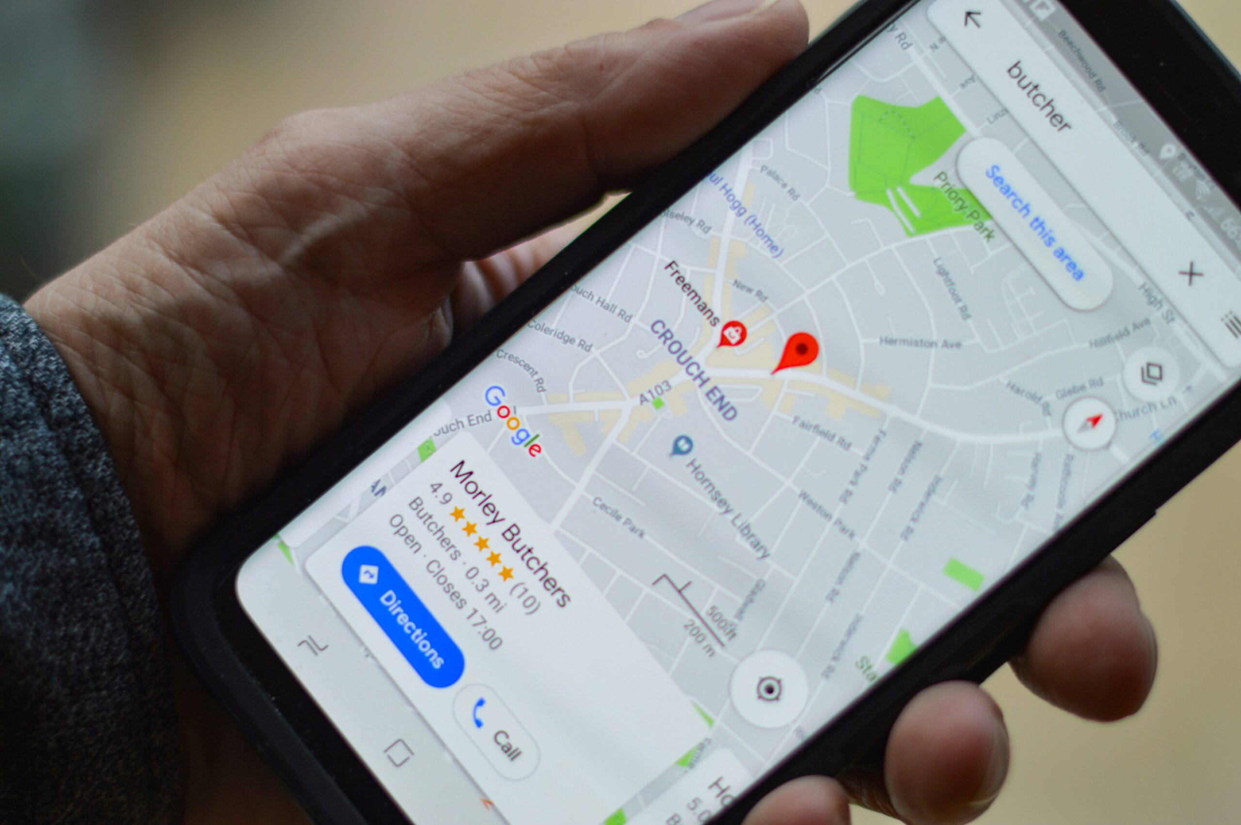
Kurz gesagt: Das ist Ihre Schaltzentrale in der Google-Suche und auf Maps. Es ist weit mehr als nur eine rote Nadel auf der Landkarte. Es ist eine interaktive Mini-Website mit Bewertungen, Fotos, Öffnungszeiten, Q&A und Buchungsfunktionen. „Local SEO“ bedeutet einfach, dieses Profil so zu tunen, dass Sie bei der Suche „Friseur in der Nähe“ oder „Autowerkstatt Berlin“ nicht irgendwo auf Seite 2 landen, sondern ganz oben in den Top 3.

Warum Sie dieses Profil nicht ignorieren dürfen

  • Der Vertrauens-Faktor (Social Proof) Sterne sind die neue Währung für Vertrauen. Studien zeigen: 88 % der Leute vertrauen Online-Bewertungen genauso sehr wie einer persönlichen Empfehlung von Freunden. Ein Profil mit 4,8 Sternen und aktuellen, echten Texten schlägt jede teure Werbeanzeige. Es nimmt dem Kunden die Angst, an den Falschen zu geraten.
  • Der Kampf um das „Local Pack“ Suchen Sie mal was auf dem Handy. Google zeigt ganz oben, noch vor den Websites, drei Karten-Ergebnisse an. Das ist das „Local Pack“. Wer hier steht, bekommt die Anrufe. Wer hier fehlt, existiert für viele Kunden gar nicht – selbst wenn die eigene Website super ist.
  • Schnelle Entscheidungen Das Google-Profil beantwortet alle Fragen, ohne dass der Kunde überhaupt klicken muss. „Jetzt geöffnet“, Fotos vom Ambiente, Route berechnen, „Anrufen“-Button. Der Weg vom Suchen zum Buchen verkürzt sich auf einen Klick. Ein volles Profil fängt den Kunden genau dann ab, wenn er kaufbereit ist.
  • Rufmord verhindern & Image pflegen Sie können (und müssen) antworten. Wie Sie auf Lob und vor allem auf Kritik reagieren, sagt mehr über Ihren Service aus als jeder Werbeslogan. Eine höfliche, souveräne Antwort auf eine 1-Stern-Bewertung kann Kritiker entwaffnen und zeigt allen anderen: „Hier kümmert man sich.“

So sieht Erfolg in der Praxis aus

  • Gastronomie (Restaurant in München): Der Inhaber lädt regelmäßig Profi-Fotos der neuen Gerichte hoch („Speisekarte in Bildern“). Er antwortet auf jede Bewertung binnen 24 Stunden. Das Ergebnis: Wer in der Gegend „Abendessen“ sucht, sieht sofort leckere Fotos und top Service. Die Konkurrenz nebenan wird ignoriert.
  • Dienstleistung (Zahnarztpraxis): Die Praxis nutzt den „Fragen & Antworten“-Bereich proaktiv und erklärt Parkmöglichkeiten und Kassenleistungen vorab. Per QR-Code am Empfang sammeln sie aktiv Bewertungen. Viele positive Stimmen mit Keywords wie „schmerzfrei“ oder „Kinderzahnarzt“ katapultieren die Praxis im Ranking an den alten Platzhirschen vorbei.
  • Einzelhandel (Modeladen): Der Laden pflegt penibel seine Sonderöffnungszeiten an Feiertagen. Während bei der Konkurrenz steht „Öffnungszeiten können abweichen“ (was Kunden hassen), steht hier verlässlich „Geöffnet“. Das bringt an Brückentagen den kompletten Umsatz der Gegend in diesen einen Laden.

Warum „Einrichten und vergessen“ nicht reicht

Viele erstellen das Profil und schauen nie wieder rein. Großer Fehler. Ein Top-Ranking ist Arbeit:

  • SEO-Texte: Wir wissen, welche Keywords in die Beschreibung und in die Antworten gehören, damit Google Sie der richtigen Zielgruppe zeigt.
  • Spam & Fake-Bewertungen: Konkurrenten spielen manchmal unfair, und Algorithmen machen Fehler. Wir kennen die legalen Wege, ungerechtfertigte Bewertungen löschen zu lassen und Ihren Schnitt zu schützen.
  • Optik, die verkauft: Das richtige Format und Geo-Tagging bei Fotos (bis hin zu 360-Grad-Touren) erhöhen die Klickrate massiv.

Fazit

Ihr Google-Profil ist das Gesicht Ihres Unternehmens. Auf dem lokalen Markt ist die Regel simpel: Selbst wenn Sie das beste Produkt der Welt haben – der Kunde geht zu dem, der leichter zu finden ist und mehr Sterne hat. Local SEO ist im Grunde der günstigste Weg, Kunden an der Hand zu nehmen und zu Ihrer Tür zu führen.

Wir machen Sie sichtbar – ohne dass Sie Stress haben

Wir nehmen Ihnen den kompletten „unsichtbaren“ Papierkram ab, damit Ihr Laden brummt.

Was wir konkret tun:

  • Profil auf 100 %: Von verkaufsstarken Fotos bis zur SEO-Beschreibung, die wirklich rankt.
  • Bewertungs-Booster: Wir implementieren ein System, mit dem zufriedene Kunden Ihnen gerne 5 Sterne geben.

Schreiben Sie uns. Sorgen wir dafür, dass man in Ihrer Stadt SIE findet – und nicht die Konkurrenz.

Continue reading

How Google Ads Actually Works (And Why It’s the Fastest Way to Get Your Phone Ringing)


Das ist nicht einfach nur „Werbung“. Es ist der einzige legale Cheat-Code, um an der Konkurrenz vorbeizuziehen, die sich seit Jahren auf Seite 1 breitgemacht hat. Gerade in Deutschland ist der Markt oft dicht. Wer hier wartet, verliert. Mit Ads holen Sie sich die ersten Kunden praktisch am Tag der Schaltung.

Google Ads – ohne Fachchinesisch

Vergessen wir mal die Buzzwords. Suchmaschinenwerbung (SEA) ist eigentlich simpel: Jemand stellt eine Frage, Sie liefern die Antwort. Ein Nutzer tippt ein: „Büroreinigung Berlin Preise“. Google zeigt Ihre Anzeige: „Büroreinigung Berlin – Hier Angebot anfordern“. Sie nerven niemanden mit Pop-ups oder Plakaten. Sie fangen den Kunden genau in der Sekunde ab, in der er sein Problem lösen will und bereit ist, dafür zu zahlen.

Warum Sie 2026 ohne Ads alt aussehen

Heute starten, morgen verkaufen

Der größte Vorteil ist das Tempo. Keine langen Redaktionspläne. Morgens Kampagne bauen, mittags Budget freigeben, zum Feierabend klingelt das Telefon. Für Startups oder saisonale Aktionen gibt es nichts Besseres.

Kunden, die wirklich wollen

Sie sehen, wo jeder Cent bleibt

Im Gegensatz zur Zeitungsanzeige tappen Sie hier nicht im Dunkeln. Sie zahlen nur, wenn einer klickt – also wenn ein echter Mensch auf Ihrer Seite landet. Die Statistik ist dabei gnadenlos ehrlich: Sie sehen schwarz auf weiß, welche Anzeige Geld bringt und welche nur Budget frisst. Wir schalten dann einfach ab, was nicht läuft.

David gegen Goliath

Egal, ob Sie erst letzte Woche gegründet haben und Ihre Konkurrenten riesige Konzerne sind – bei den Anzeigen herrscht Waffengleichheit. Sie können sich den Platz ganz oben erkaufen. Und wir können das so feinjustieren, dass die Werbung nur in Ihrem Kiez oder nur zu Ihren Öffnungszeiten läuft. Das spart Geld.

Wie das in der Praxis läuft: 3 Szenarien

Der Notfall (Schlüsseldienst / Abschleppdienst):

Der Kunde hat Stress. Er blättert nicht auf Seite 2. Er klickt auf das erste Ergebnis, fertig. Wenn wir das sauber einstellen, landen 90 % dieser Notrufe bei Ihnen.

Der Shop (E-Commerce):

Hier nutzen wir Google Shopping (die Bilder mit Preisen direkt oben). Der Kunde sieht den Preis sofort. Ist er ihm zu teuer, klickt er gar nicht erst. Sie zahlen also nichts für Leute, die eh nicht kaufen würden. Effizienter geht’s kaum.

B2B und Dienstleister:

Hier gehen wir nicht auf Masse, sondern auf Klasse. Wir nutzen Fachbegriffe, die nur Profis kennen. So filtern wir Privatleute raus und zeigen die Anzeige nur Entscheidern. Ein einziger fetter Auftrag finanziert dann oft das ganze Jahresbudget.

Warum „Selbermachen“ meistens schiefgeht

Viele denken: „Ach, paar Keywords eintippen, Text dazu, läuft.“ Realität? Das ist der schnellste Weg, Geld zum Fenster rauszuwerfen. Ein Profi-Setup ist eigentlich eine Versicherung für Ihr Budget:

  • Negative Keywords sind Pflicht: Verkaufen Sie Designermöbel? Dann sind Sie pleite, wenn Sie nicht Begriffe wie „billig“, „gebraucht“ oder „IKEA Hack“ blockieren. Wir sortieren diesen Müll-Traffic von Anfang an aus.
  • Der Klickpreis-Kampf: Google ist nicht dumm. Ist Ihre Anzeige schlecht, berechnet Google Ihnen „Strafgebühren“ (höhere Klickpreise). Wer es drauf hat, zahlt für denselben Platz deutlich weniger. Wir wissen, wie man diesen „Qualitätsfaktor“ hackt.
  • Ständiges Nachjustieren: Der Markt bewegt sich. Was heute zieht, ist morgen tot. Werbeanzeigen muss man betreuen, sonst verbrennen sie Geld.

Fazit

Google Ads sind keine Kostenstelle, sondern eine Geldmaschine – wenn man sie richtig bedient. Sie stecken 100 Euro rein, um 300 rauszuholen. Wer wachsen will und keine Lust hat, auf Mundpropaganda zu hoffen, kommt daran nicht vorbei.

Lassen Sie uns das für Sie regeln

Hören Sie auf, der Konkurrenz das Feld zu überlassen. Während Sie noch grübeln, verkaufen die schon an Ihre potenziellen Kunden. Wollen Sie echte Anfragen oder nur hübsche Diagramme? Wir kennen den deutschen Markt und wissen, wie man Kampagnen profitabel macht.

Unser Deal:

  • Kein Kaffeesatzlesen: Wir gucken auf harte Zahlen und die echte Nachfrage in Ihrer Nische.
  • Kosten im Griff: Sie wissen immer, was ein Neukunde wirklich kostet. Keine versteckten Gebühren.
  • Fokus auf Kasse: Klicks sind uns egal. Uns interessiert nur, was am Ende auf dem Konto landet.

Schreiben Sie uns kurz. Wir schauen uns Ihre Seite an und sagen Ihnen ganz ehrlich, mit welchen Zahlen Sie eine Woche nach Start rechnen können.

Continue reading

5 Strategies to Attract Clients Through a Landing Page: How to Turn Traffic Into Leads

1. A Structure That Leads to Action

An effective landing page structure isn’t just a collection of blocks “like everyone else’s.” It’s a logical sequence that guides the visitor toward a specific action.
  • Headline + Subheadline — explain what you offer and who it’s for.
  • Offer / Benefit — why it matters right now.
  • Social Proof — testimonials, case studies, client logos.
  • Benefits / How It Works — explain why you are the right choice.
  • Call-to-Action (CTA) — one button, one action.
  • FAQ or Objection Handling
  • Contact Form / Quick Way to Get in Touch
Tip: Don’t overload the screen. One landing page — one goal. Want to sell and promote a webinar? Create two separate pages.

2. Strong Offer + Urgency

If you want to increase your website’s conversion rate, forget about phrases like “Welcome to our website.” People don’t read — they scan. The first thing that should grab their attention is your offer.
  1. Weak offer: “Financial consulting for everyone.”
  2. Strong offer: “I’ll analyze your finances in 45 minutes and show you where you’re losing money — for free.”
Add urgency or scarcity to drive action:
  • “Only 5 free consultation slots left for July.”
  • “Offer valid until Sunday.”
This motivates visitors to act. Without it, your landing page is just another page on the internet.

3. Video = Trust

In 2025, text doesn’t work like it used to. People trust faces and voices. Record a short, simple video that explains:
  • Who you are
  • How you help
  • How your service or product works
  • How to contact you
It doesn’t need to be a high-end production. What matters is authenticity and honesty. Video + photos + testimonials = a powerful trust-building combination.

4. One Focus — One Goal

A high-converting landing page is focused. Don’t confuse visitors with too many options or buttons.
  • No three buttons like “Learn more,” “Download price list,” and “Submit request.”
  • No ten different services on one page.
  • Don’t ask the user to choose — guide them.
Rule: One form, one CTA, one goal. Everything else is noise that reduces conversions.

5. Automatic Connection With Ads

Your landing page is just one part of the marketing chain. It should logically continue your ad message. If your ad says: “How to relieve back pain in 7 days — without pills,” your landing page headline should repeat that. Not “About our Health+ Clinic.” Context → Click → Landing Page → Trust → Action. That’s how real lead generation works — guiding users step by step, without breaks.

Bonus: A Marketer’s Checklist for Your Landing Page

Check your landing page using this simple checklist:
  • Is it clear what you offer — right on the first screen?
  • Does your headline have a strong hook?
  • Is there a face, testimonial, or example?
  • Is there one clear CTA?
  • Does the page load fast and work on mobile?
If the answer to any of these is “no,” your conversion rate will drop — even with good traffic.

Conclusion: A Landing Page Is Not Just a Page — It’s a Salesperson

A successful landing page replaces a salesperson. It explains, convinces, and drives action. Attracting clients through a landing page isn’t about “just making a page.” It’s about:
  • a clear offer,
  • a logical structure,
  • strong visuals,
  • a precise CTA,
  • and consistency with your advertising.
Do this right — and even cold traffic will turn into qualified leads.

FAQ

  1. How many sections should a landing page have? Between 5 and 8. The key is balance — not overloaded, but not empty. Each section should have a clear purpose.
  2. Is video required? No, but it helps a lot — especially for trust-based services. A short video introduction works better than text alone.
  3. What influences conversion the most? Your offer, headline, CTA, and mobile optimization. These four elements drive 80% of the results.

Optimize Your Landing Page With Us!

If you want to create a landing page that sells, we’re your ideal partner. Our experts analyze your audience, craft a compelling offer, and design a structure that significantly boosts your conversion rate.
  • Strategic design: We combine psychology, marketing, and UX for maximum impact.
  • Tailored solutions: Each page is crafted specifically for your brand and audience.
  • Continuous support: We help you not only build but also optimize your landing page over time.
Contact us today to learn more about our services and start turning your website traffic into qualified leads!

Why is it so important to advertise your company online?

Why marketing is important for companies in Germany

  1. Increasing brand awareness In Germany, competition is fierce and brand awareness is the first step to success. Studies show that 77% of German consumers are more likely to buy brands that they are familiar with. Through targeted marketing strategies, such as online advertising, social media and content marketing, companies can increase their visibility and build trust.
  2. Attracting and retaining new customers One of the biggest challenges in Germany is not only attracting new customers, but also retaining them in the long term. According to a study by McKinsey, there is a high willingness for customer loyalty in Germany if companies offer personalized offers and excellent service. Marketing plays a central role here by addressing customer needs and promoting customer loyalty through tailored campaigns.
  3. Increasing sales through targeted campaigns Companies that invest in marketing often see a significant increase in sales. According to the German Marketing Association, companies that increase their marketing budget by 10% can expect an average increase in sales of 7%. Marketing strategies such as PPC (pay-per-click), SEO (search engine optimization) and email marketing contribute directly to increasing sales.
  4. Market analysis and competitiveness Germany is a dynamic market with constant changes in consumer trends and technologies. Marketing strategies include market analysis, which enables companies to adapt quickly to changes and remain competitive. Successful marketing helps to respond appropriately to both opportunities and threats in the market environment.

Successful marketing strategies in Germany

  1. Siemens: The company uses targeted B2B marketing strategies, including content marketing and thought leadership, to consolidate its leading position in the field of Industry 4.0. By focusing on technological expertise, Siemens was able to strengthen its brand reputation in Germany.
  2. Lufthansa: The airline relies on omnichannel marketing that incorporates both online and offline channels. With personalized campaigns based on customer behaviour, Lufthansa was able to increase customer loyalty and ticket sales.
  3. Birkenstock: The German shoe manufacturer uses social media marketing to market its products internationally while strengthening its domestic market. By combining traditional and digital marketing, Birkenstock was able to increase its brand awareness both in Germany and worldwide.

Why professional marketing strategies are crucial

Professional marketing involves more than just placing ads. It includes:

  • Market research: to understand the German market and address specific needs.
  • Target group analysis: To precisely define the target group in Germany and develop targeted messages.
  • Strategic planning: To develop effective campaigns that meet business objectives and the local market.

Professional marketing strategies ensure that marketing budgets are used efficiently to achieve the best results.

Conclusion

Marketing is the backbone of business success in Germany. It helps to create brand awareness, attract customers and increase sales. With a professional and well-thought-out marketing strategy, companies can strengthen their position in the German market and achieve long-term growth.

Order a professional solution for your company from us!

If you want to develop a strong logo, a consistent corporate design or an effective marketing strategy, we are your ideal partner. Our experts will thoroughly analyze your business to create tailor-made solutions that emphasize your values and make your company stand out in the market.

  • Individual approach: We take into account the specifics of your business and develop personalized solutions.
  • Experience and professionalism: Our team has in-depth knowledge of branding and marketing, which enables us to achieve real results.
  • Support and advice: We offer not only the creation, but also the accompaniment of all the solutions developed for your business.

Contact us today to learn more about our services and get advice on how to grow your business!